Saturday 23 November 2013

November..... What's been happening?

Not a lot really!
I think because life was so busy for the last couple of months and next month is Christmas I decided to give myself a little break. Although there have been a trip to Rotorua, Whakatane and Tauranga in there.

This months challenge for ARTastic was one I was looking forward to. The art is called Listen by Kiwi artist Jenny Grant.


The criteria was free choice as long as your inspiration came from this art. For me this piece screamed out texture, layers and subtle colours.

So I decided to scrap a picture of my 'Beautiful Ghoul' Alana in her vampire dress up.


The paper is some left over paper I had from a class with Paula Cheney. I can't remember the brand but I love the deep subtle colours and decided to pick up the shades of yellow through the flowers, inking some ribbon and the lace. To add some texture I rolled the edges of the paper and used Gesso with the Prima Doily stencil. A couple of charms, metal flowers and a bit of bling and I am really happy with this layout!

Thanks for coming and looking.
Please leave me a comment to let me know what you think.

Tuesday 29 October 2013

Busy couple of months!

Wow, what a busy couple of months our little family has had!
Top of our best of times had to be the family holiday to the Gold Coast.
The holiday of a lifetime!
Here are a couple of my favourite pics.

The Log Flume at Movie World. It was our second ride and we were all gonna smile at the camera. Good one Shane!

Cuddling a Koala at Dreamworld.

Alana got to play with the Dolphins at Seaworld.

Snake! At Currumbin Sanctuary.

A favourite ride at Dreamworld.
 Loads of memories and even more scrapbooking to do. I took 1100 photos :)

So what scrapbooking have I been doing?

For the September Challenge over at ARTastic Challenge Blog
the inspiration was Holiday Homes by Michael Cartwright.

 
The criteria was quirky and fun! What a fun challenge it was too. I decided to challenge myself by trying something whimsical and using a photo that was cut out. Something I don't often attempt, but I was really happy with the results!


The flowers are from Prima, butterflies from Jenni Bowlin and I have used a mask by Crafter's Workshop with Gesso. The paper is the 'Dancing Girl' range by Fancy Pants. The chip branch is from ScrapFX.

Next was the October Layout. For this month ARTastic chose an amazing piece of art by Mia Taninaka called Salvation.

 
The criteria is to include wood and/or feathers. I sort of included both. The layout I did was inspired by a sketch I found, I'm sorry but I don't remember where from though :)


The paper is from the Basecoat range by Kaiser on a Bazzill background. I have added some wooden accents from Imaginarium and Jenni Bowlin, a doiley from Prima, some decorative tape and some other bits and pieces.

Another project that I have just finished are 9 treasure boxes for my mother-in-law to give as present for some friends. These were heaps of fun as I haven't made something off the page for a long time. 


The boxes are from Spotlight, papers, bling and flowers by Kaiser (Curiosity Range), Prima flowers and an old dictionary.

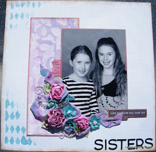
And last on my list of recent creations was this layout for myself. Just cause I can :)


The papers are from the 'Indigo Bleu' range by Pink Paislee. This range has a beautiful subtle feel to it and has greys, yellows, blues and teals. To finish the layout I used some transparencies, buttons, brads and staples. A touch of Glimmermist and Distress ink to soften the edges.The alphas are from Prima.

Thanks for coming over and having a look, can't wait to see how my November layout looks.


Saturday 24 August 2013

Prima August BAP Layout

I am really proud of this layout. It was a spur of the moment selfie with my man photo opportunity and it captured us here and now. Thus the theme of my layout.
 The sketch from Prima that leads the challenge is:

2013 August BAP 

I really liked the idea of the balance that the sketch shows and although I didn't want to use that big a photo I have used a larger photo than I usually use. I love the colours of the Annalee Collection and this is what formed the base of my layout.


I have used three papers from the Annalee collection for this layout along with Prima Resist Canvas, Prima Tag, their Candy Gems, flowers and Art Tiles. To this I have added some doiley, book paper, ribbon, washi and metal trinkets. I have tied it all together with Distress Ink in Tea Dye.

Thanks for reading, I hope you enjoy!
Lesley.

Better Late than never :)

So as you can all see I haven't posted for a while. Things have been a bit crazy!
But here I am and I hope to catch up on a few things.

As you know I am on the design team for the challenge blog ARTastic and I have a couple of months worth of layouts to show you. The last one I posted was from April so here is May:

The May challenge 
was based on Michael Duncan's art Tea Time 2012


The criteria to use stenciling and for my layout I used some letters and a Stencil from Crafters Workshop. The photo is my lovely girls school photo from last year.


 It is a fairly simple layout, using Bazzil, Tim Holtz Distress Paints, Flowers by Kaiser & Prima, ribbon, bling & Aplha by Prima and the paper is of unknown brand (SORRY!)

Next we had the June Challenge
This month we were inspired by environmental artist 
Susan Schenk and her piece Robin's Nest. 


 The criteria was to use recycled items on our layouts, and this was a challenge! I decided to do a layout using a brochure from a hotel we stayed in when we went to Amsterdam. I added items from our stay as embellishments and used inks and stamps to decorate. The background paper is the backing from some Prima Alphas.


 It was a great trip down memory lane! I even used some coin from Europe to add some texture.

July Challenge
I really enjoyed this challenge, it was based on a charcoal and pastel painting by artist Lorraine Lewitska entitled Rock n Roll Party.

 
The criteria to use black, white and one colour. I found a photo of my Grandad who has passed away and was inspired by the sepia tones of the photos. So my colour was brown/beige. The paper in the background provides a nostalgic feel to the layout and I have added some elements to reflect this. Some Black Glimmermist, Gesso, transparencies, Washi Tape and it was done!


 And I am very happy to say I got voted DT layout of the month!
Yippee!

Stay tuned for my August Challenge Layout!
I have also entered a couple of challenges for Prima but I didn't get anywhere with those. That's OK because it was a challenge and I did enjoy using pretty much all Prima for a layout! These were entered in the BAP Sketch contest they have monthly.


 The above layout didn't have as much Prima as they probably wanted but for my first go I really liked the final product. It was only really the flowers that were from Prima.


 This layout I really liked and was proud of the finished effect. Lots of cutting, flowers & bling.

So that has been me for the last couple of months. I am putting together my next layout for the August Prima BAP and will load that up very shortly.
Thanks for reading!


Monday 3 June 2013

April Challenge for ARTastic.

Good morning all, well I am at home with a sick young lady so thought I would make the most of it and get some posting done. As you know I am on the Design Team for ARTastic Challenge Blog and I am submitting monthly. But I have just realised I haven't put pictures up from the April challenge. May will be up once winners etc have been announced.

April's challenge was based on Australian Indigenous Artist, Trevor Nickolls with his piece Warmun Mandala.


The criteria for our projects was to use these colours.
I have graduated from my studies and my Diploma finally came in the mail. At the time I was wearing an orange top and he colours in this art really called out for me to scrap this photo.


A couple of recent purchases from Spotlight co-ordinated wonderfully with this challenge and the theme of my layout. Along with Kraft paper and some dotty Prima paper I have used paper from Kaisercrafts Class Act collection. This is where the ruler cut outs have come from.
I also purchased a clock stencil that I have used to add texture with Gesso. My first attempt to use Gesso so really excited to keep experimenting! The flower bunch is from Prima and the chipboard cut-out is by Imaginarium.
Stoked with the final outcome and it is a great way to remember the hard work that went into three years of study.

Happy scrapping everyone!

Saturday 25 May 2013

This weekend I have actually managed to get some scrapbooking done! I was inspired by the May challenge set on Artfullcrafts Blog.
The Challenge Theme came from watching the Sound of Music and inspired by the song "My Favourite Things."
So that is the theme of this challenge... what are your favourite things!

And for me, that would be my family. My husband and my two beautiful girls, this photo was taken on Father's Day last year and we were fishing at the Huka Prawn Park. A favourite place for us to play.


The layout was inspired by a class I did recently at Autumn Escape Scrapbooking Retreats by tutor Nic Howard. I have taken a nice cream Bazzil and grunged the edges using stamps and distress inks.
I have used paper and elements from Teresa Collins, Kaiser, Elle's Studio, Prima and Tim Holtz.

Here is a close up of the flower cluster, I inked it with Glimmermist to tie the flowers into the colour scheme.


Thanks for coming and looking at my work!
Happy scrapping everyone.

Saturday 27 April 2013

One of my favourite places to scrapbook, excluding my home, would have to be
The atmosphere is energising and inspirational and hosts Nic Howard & Lucy Vanderloos really make you feel like one of the family.
The latest retreat was held last weekend and I was very busy! I did three classes (more are available for those who like to attend), my table mate did SIX!
But I also completed some layouts of my own.
Here are my layouts completed in classes:


Creative Grunge with Nic Howard:
This layout is very layered and as the name would suggest grungy. After layering the embellishments we added Gesso and Glimmermist to bring it to life and co-ordinate the colours.

This is a close up of the cluster of embellishments!
This is the layout using the tag we practiced on, I love it! Simple and it allows the photo to shine!


Black & White and Coloured All Over with Nic Howard:

This class was really fun and there were so many different layouts that came out. It has used stamping, Washi Tape, Transparencies, and Tim Holtz Distress Paint. Love that you can adapt it to what you have and what suits. I already have another one on the go!!

Gather and Glue by Rachel Tucker:
This class was a little different in that it isn't a layout, as such. The page has numerous pockets that can be filled and scrapped. It can also be added to on the other side, thus double-sided. A great way to scrap an event or occasion that you have heaps of photos for. I still need to add journalling and a title, but that will come. All the photos I have used were 3x4 but the top and bottom rows can fit 6x4 if you want a whole photo in there.

So those are the classes I did, AWESOME!!
As for what I did for myself here are a couple of them, the rest I am saving for later as they are going on other blogs first :)

This was based on a sketch challenge that was issued during the weekend. I didn't win, but loved the end result.

This layout is being entered into a monthly scrap challenge for my local store Scrapbook Cottage. The challenge was based on a sketch from Stuck Sketches and the criteria was to use Washi Tape. Lets see how I go!


A close up of the flower cluster.

I just want to add a huge thanks to everyone at the AE Retreat! You guys really make the weekend the fun that it is! I am so looking forward to seeing you all next year and gutted I can't be there for the Prima-ArtVenture-2013.

Friday 29 March 2013

So not a lot of scrapbooking and creativeness happening lately due to a number of factors. Probably the biggest is that we moved house, and it is a smaller house so having to figure out new storage ideas for all my stuff. And Mr French had his knee operated on, making me the main housekeeper for a while. Busy, busy, busy :)

But I did manage to get a layout done for Artastic and their March Challenge. This month the challenge was based on:

Australian Artist Portrait Artist Julia Stattout with her painting Girl in Pink.


The criteria was to use a portrait photo. I have been going through some old photos with Mum and found one of me when I was just about 3 years old. The colours are quite muted and one that stuck out to me was a slight teal colouring. I was in AJ's Emporium, Rotorua the other day and found the cool ribbons that I have used. I suppose it is a monochromatic layout in that most of the elements are teal in colour.


The paper I have used is unknown sorry to say. It has been in my stash for quite a while, but a guess would be K&Company. There is Bazzill and letters from Prima and I have inked all round all the edges with the Tim Holtz Distress Ink; Walnut Ink. The butterfly's were bought from the jewellery department at Spotlight, and yes that is a tassel on the end of my title. I also used a Bazzill stitching template to add texture around my paper.


I hope you enjoy my layout, I certainly enjoyed reminiscing with my Mum. By the way, the photo was taken by a professional photographer who is now my Dad :)


Tuesday 26 February 2013

February's challenge at Artastic Challenge Blog is focused on the following:

February inspiration comes to you from famous Australian artist ... 

Charles Meere (1890-1961) with his painting Australian Beach Pattern (1940)

Criteria - Free choice, make of this as you will
 
As their new designer I am proud to offer my interpretation of the challenge. What really appealed to me were the colours in the painting; mostly muted browns and blues with hints of bright. I found one of my favourite photos of Alana and Rylie back on a family holiday to the Coromandel, it had those muted colours with a touch of pink.
This is my layout:
 
 
I have used some gorgeous but older Crate Paper for the base and the background. Some paper lace from K&Company, stencil, twine and letters from Prima.
 
Please head to Artastic Challenge Blog to see what the rest of the Creative Team and the challengers have submitted. Quite a variety of styles and layouts.

Tuesday 5 February 2013

This layout has been created for the February challenge at Challenge Me Happy. The have Bi-Monthly challenges!  http://challengemehappy.wordpress.com/.

The criteria was to create a layout that has "White Space". This is my submission:


I have used a piece of Kraft paper as the base, flowers from Prima, pearls and a chipboard number from Maya Road.

Sunday 27 January 2013

The gorgeous art work that inspired this challenge: My Blue Angel by 3D chalk artist - Jenny McCracken
This layout is one that has been made to participate in an online challenge for http://artasticchallengeblog.blogspot.com.au/ The criteria was based an a 3D chalk artists painting of an angel and needed to include either wings or chalk.
I was going to use some chalk but not having any in the house sort put an end to that idea. So the above was the end result. It is my favourite photo of my brother Nick and his new wife Kim on their wedding day. It is very candid and natural. I chose the bright colours because they were an important part of the day; Kim was wearing hot pink boots under her dress with rainbow socks! The products I have used are Bazzill (Black), Kaisercraft paper and gems, Prima flowers, Scrapmatrix word & butterfly, TimHoltz Ribbon and Glimmer Mist and Tag from Tattered Angels.